carambaia publisher, 2017



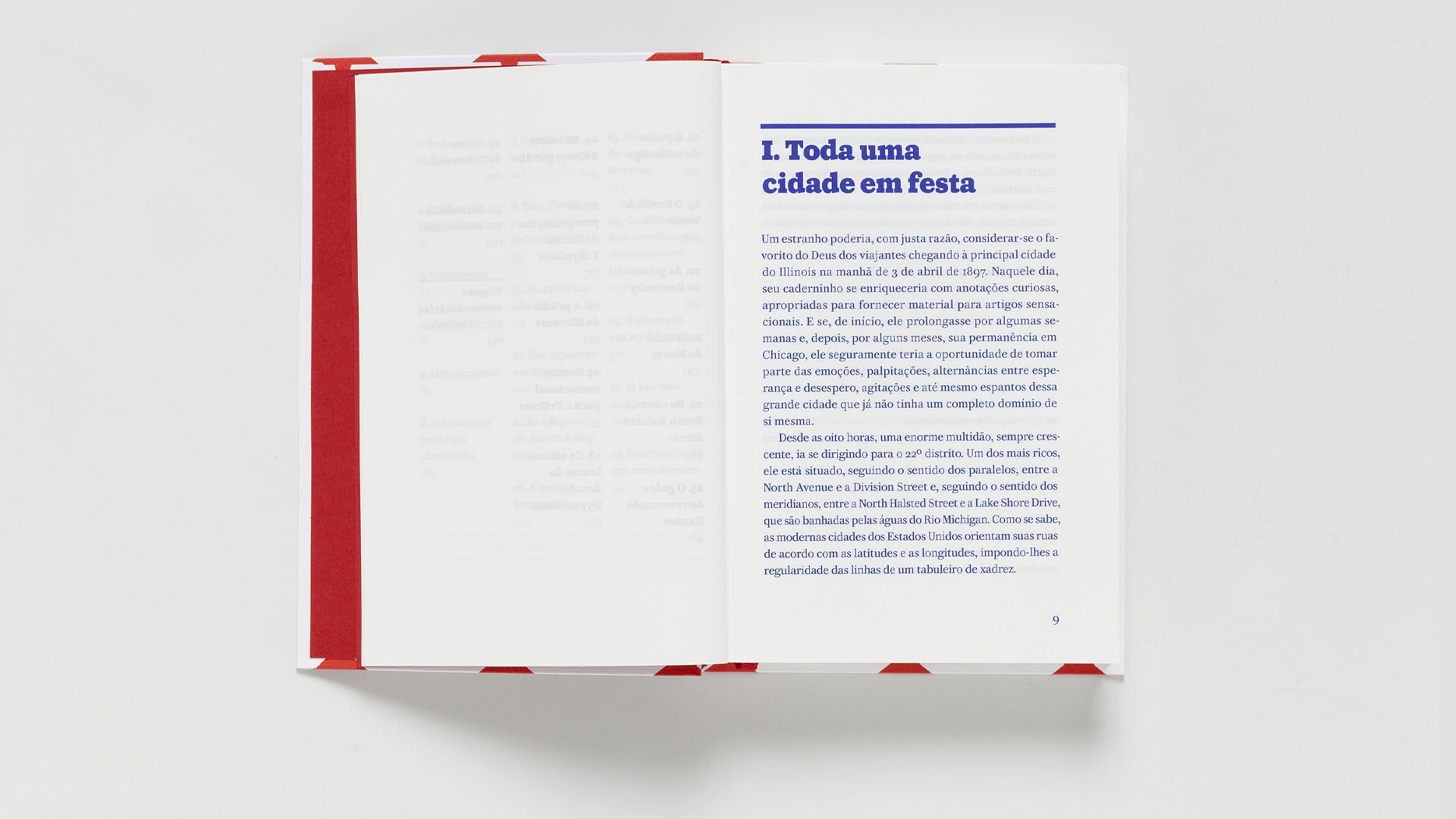
the cover and interior design of this numbered book edition in portuguese adds a set of images from the archive of the library of the united states congress to the text by jules verne — first published in 1899 by the parisian publisher pierre-jules hetzel. the photographs and maps, produced at the time of the original text, bring fragments of the north american atmosphere that inspired verne.
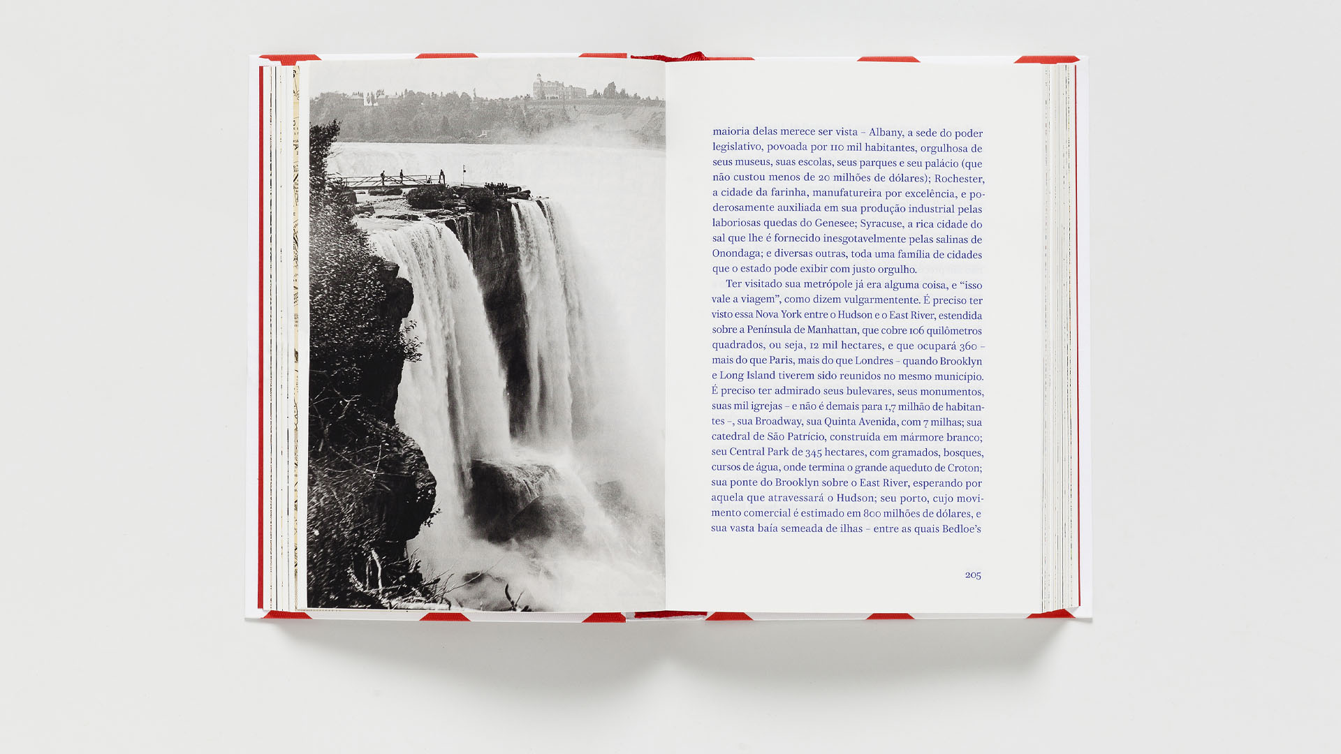
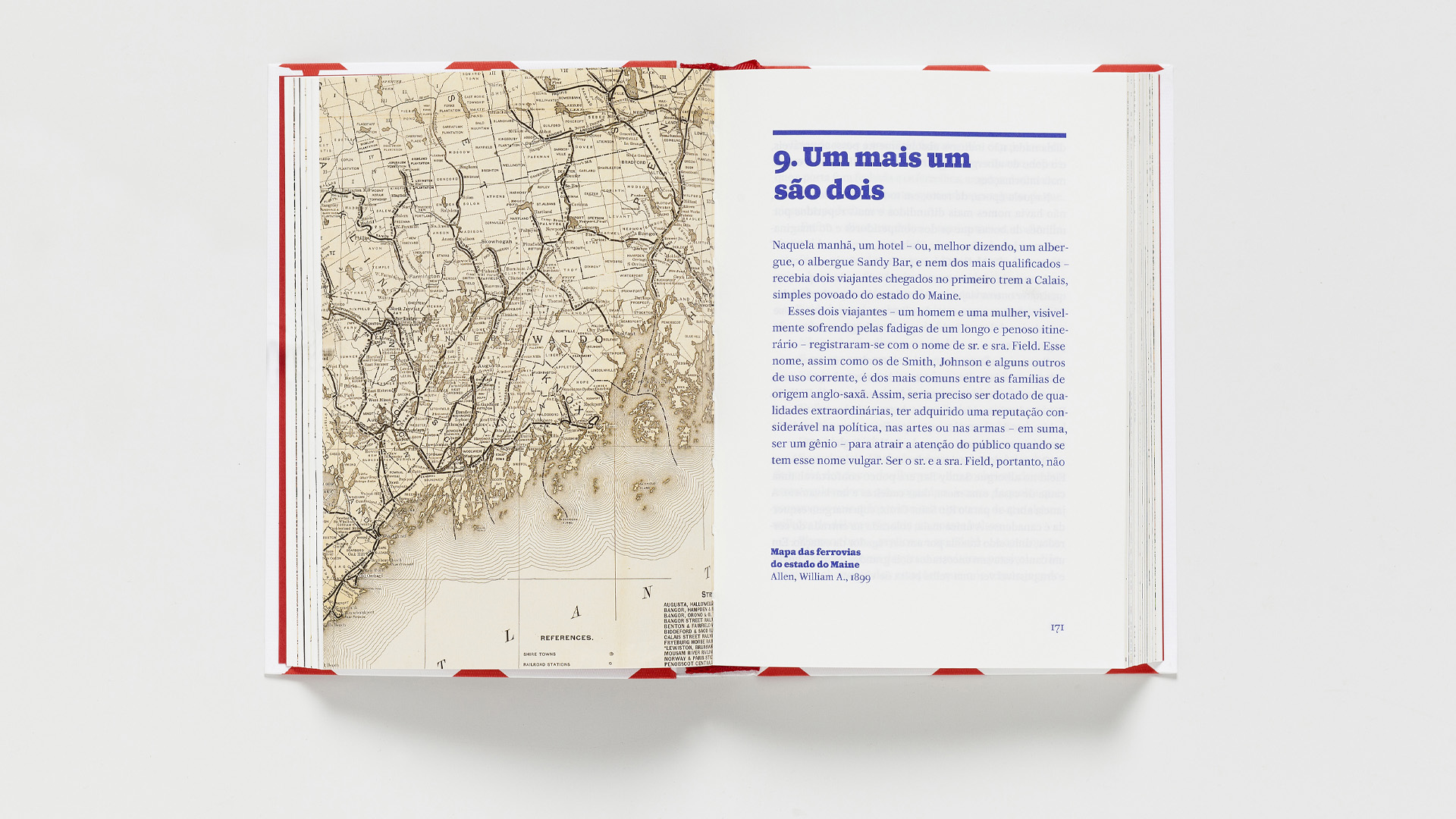

the text is entirely composed in the font ‘caponi’ — designed by miguel reyes, christian schwartz and paul barnes, in 2014. one of the variants of this family is the slab (a font with thick, rectangular serifs, also known as ‘egyptian’), which is used in the titles of both the book and its chapters. caponi slab reflects the typographic spirit of modernity in the 19th century, in which printed messages sought, by visual impact, the attention of the crowds that gathered in large cities.
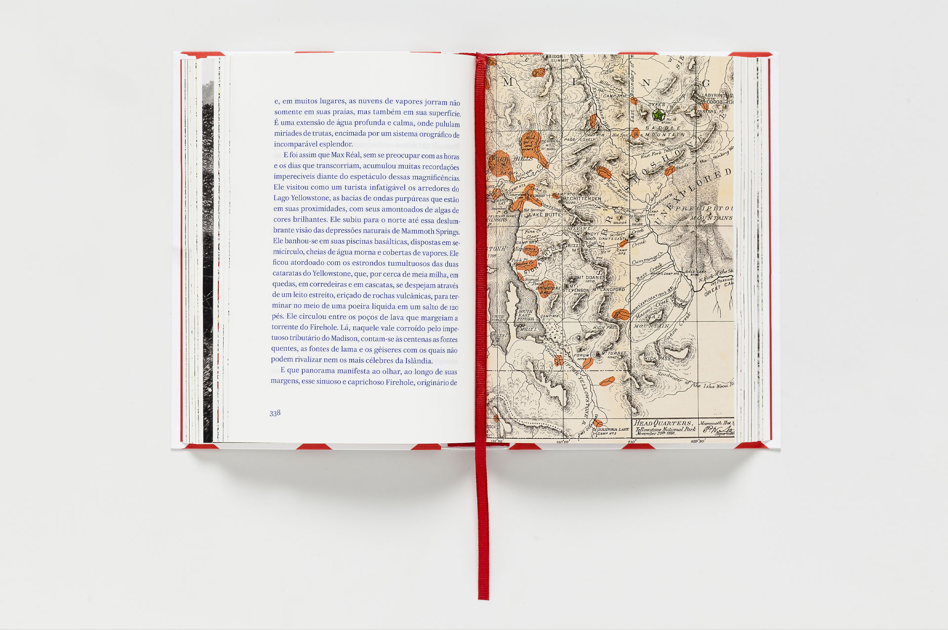
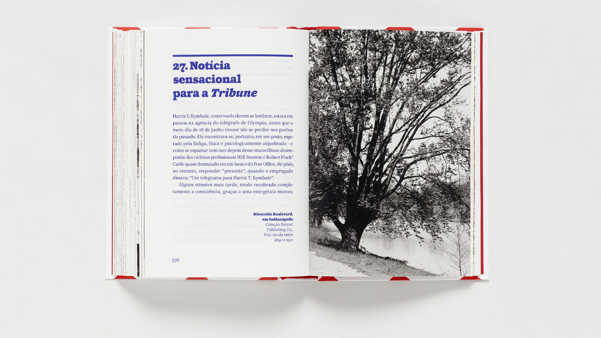
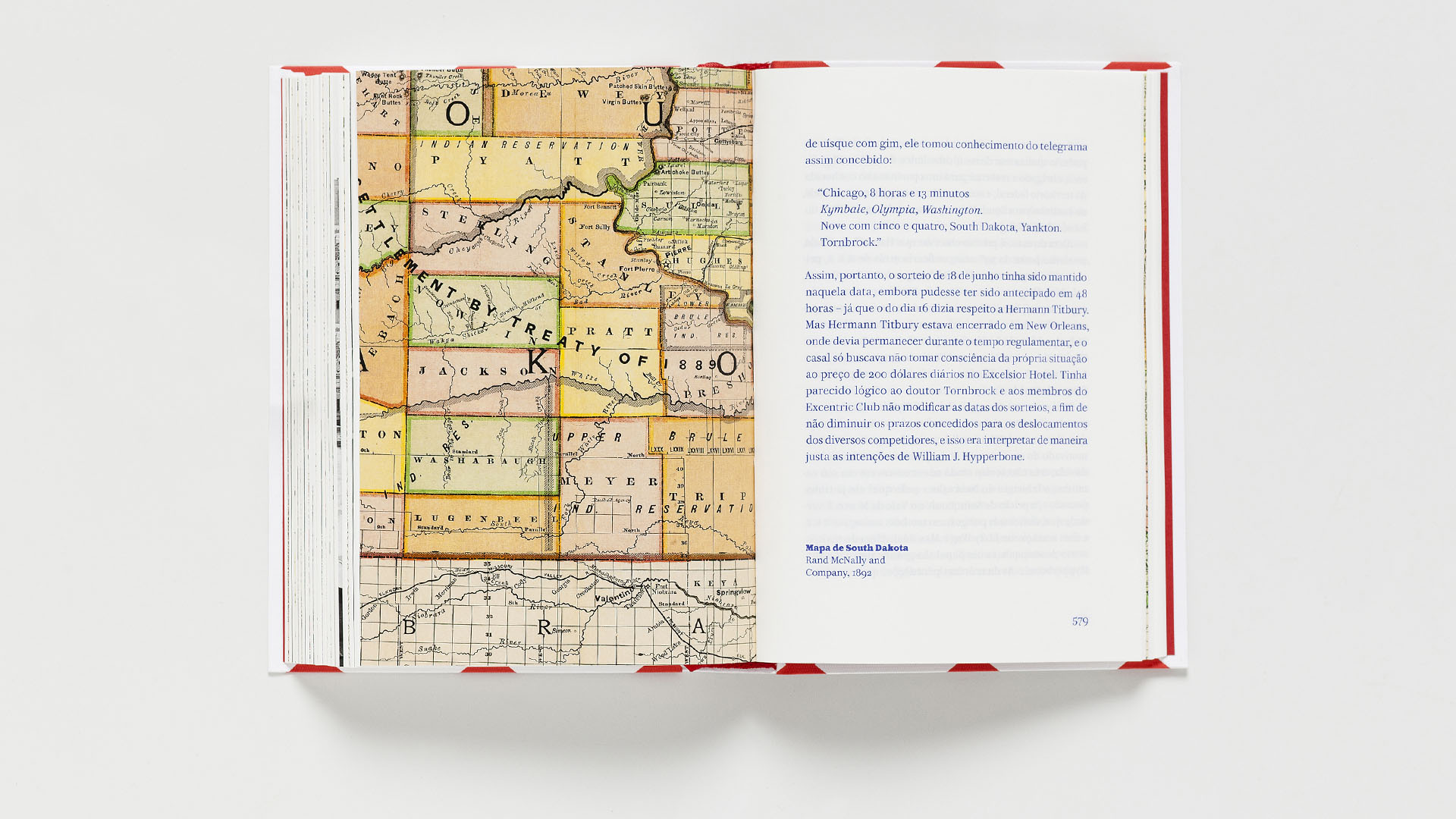
the small format book, wrapped in a flexible cover, was printed on two papers: one uncoated, light weight, for the printed text (more than six hundred pages) and the other, coated, intended for the period images that are inserted, in simple slides, between the text signatures.