todavia publisher, 2017
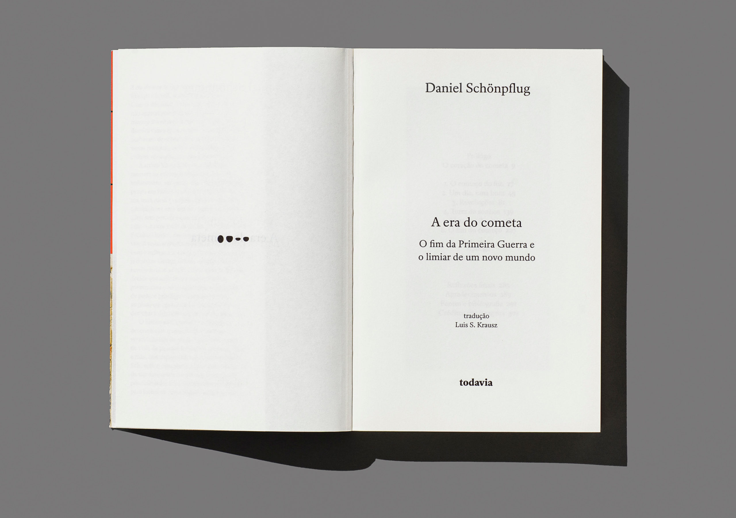

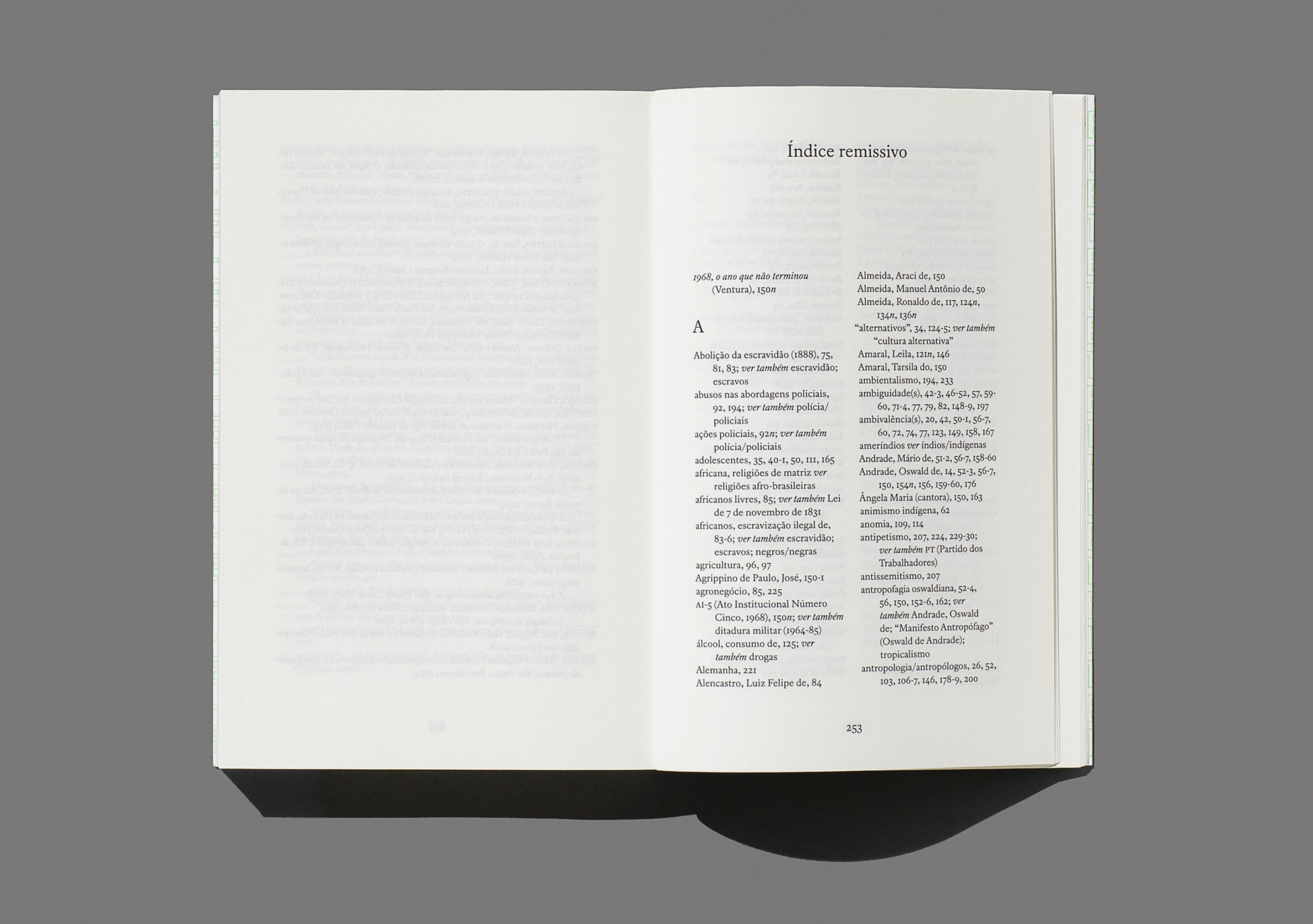
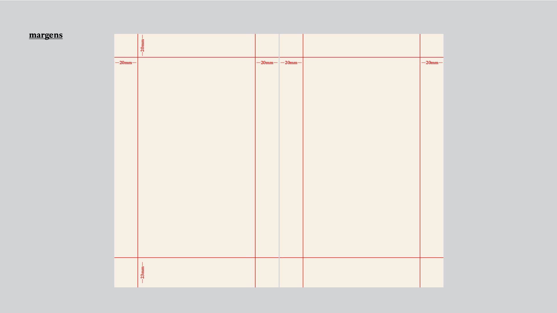
the challenge of a standard interior book design for todavia publishing house was to accommodate the text layout for the most diverse genres — novel, essay, poetry, biography — and their particularities. visual hierarchy and space efficiency were points of attention.
at the same time, the design should have a vocation for invisibility — it is the reading and the readability that matter. however, almost contradictorily, it was necessary for the project to stand out somehow.
thus, the typography adopted in the project, register*, with a bookish feel, is the same used in the publisher’s logo — making its visual identity present on all the pages of its books.